I've been interested in horses and art all my life, but only relatively recently have these two passions come together. It is strange how life's events push you in ways you had never expected and sometimes the results can be extremely surprising and often very satisfying.
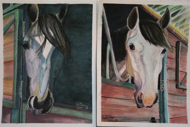
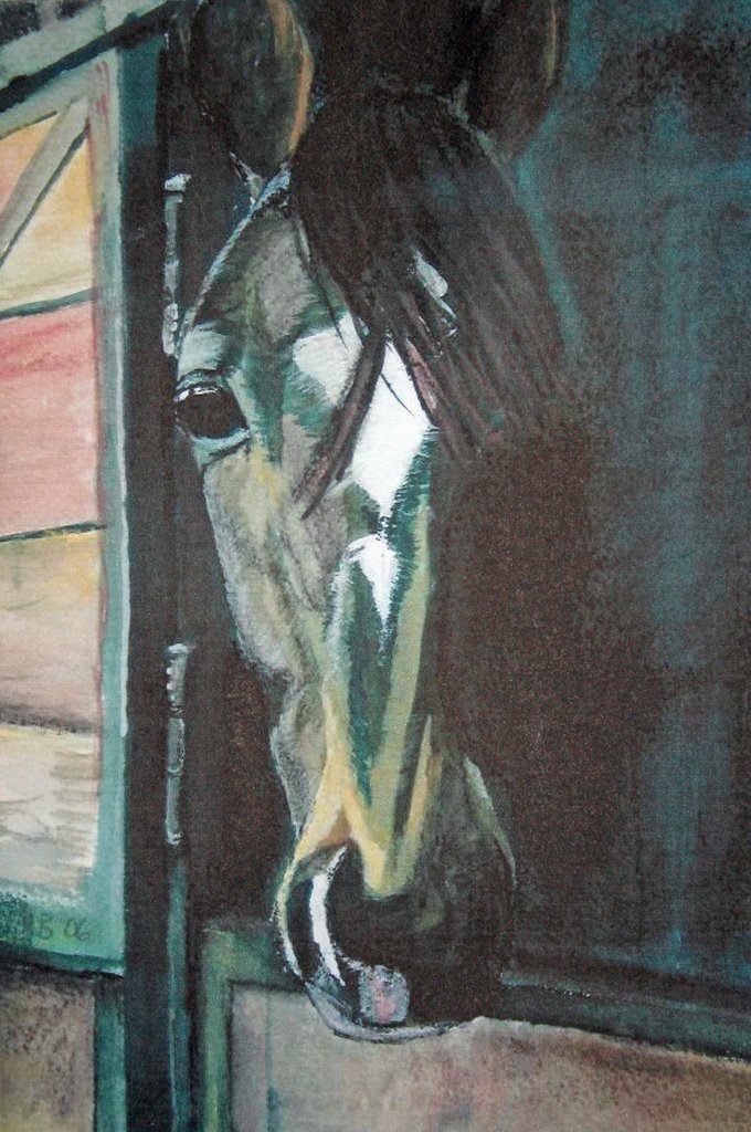
I live close to a riding stables that teaches children and adults to ride using classical methods. My daughter started riding there about two years ago and then about a year later I also started to ride again after a break of about twenty years. I was struck by the beauty and gentleness of the Lusitano horses the we ride and one afternoon I took out some oil pastels t
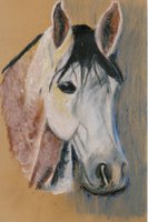
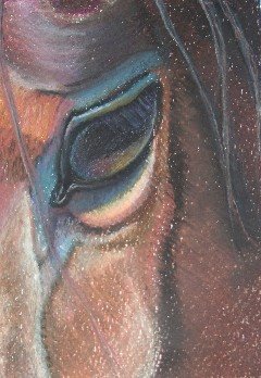
hat I had bought as an impulse buy and started to draw one of the horses at the stables. His name was Ramases and he struck me as such an intelligent horse. My attempts to capture him were not very good, but I really enjoyed working with the pastels and it gave me heart to go on and learn to develop this medium.
hadn't drawn or painted since I was at school. I knew that I was finding my feet again and that it would take time and a great deal of practice. So that was the beginning.
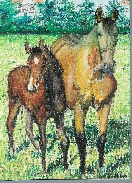
The next few efforts gave me enough encouragement to continue. I drew oth
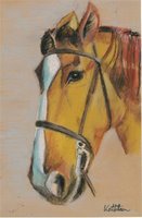
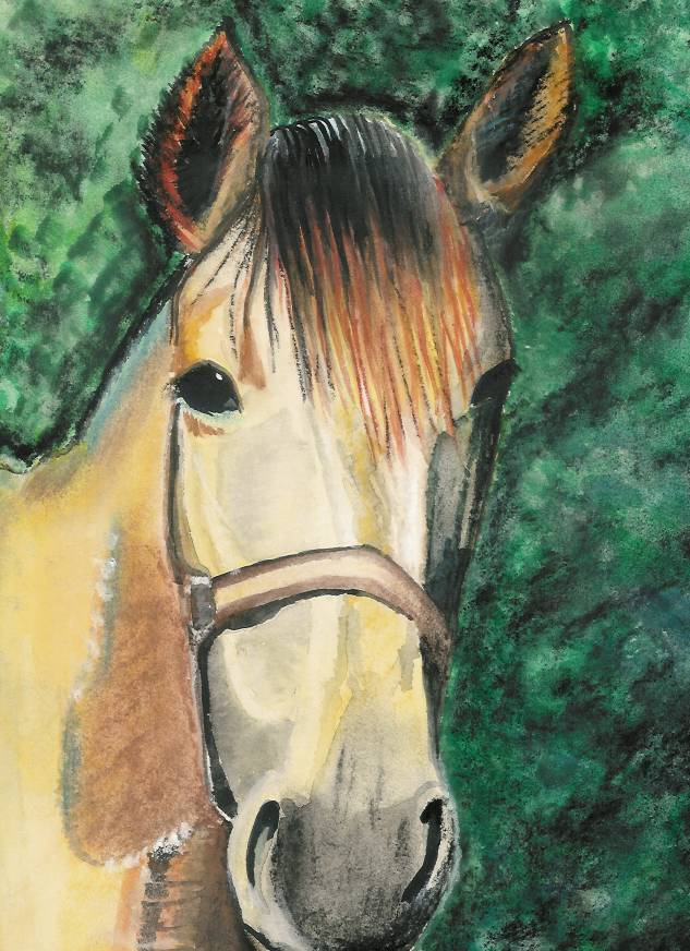
er horses from the stables. An old chestnut called "Gentille" who looked like a c
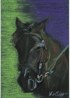
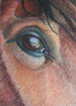
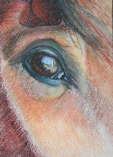
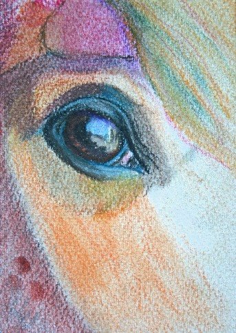
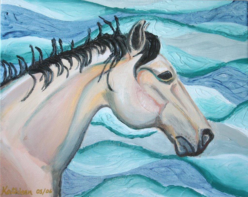
avalry horse and "Quixote" a dark, shaggy, heavy-built cob. and one of the foals. By now, I was changing how I thought about things. I was beginning to get itchy fingers wanting to do more than just pass the time on a Sunday afternoon. While I liked working with the oil pastels I wanted to try other things so I opted to try some watercolour painting. I had never really used watercolour except as a wash over some of the drawings I had done at school. My attempts with watercolour were not what I had hoped for I couldn't get the softness that I was looking for, and I couldn't
control the colour but I was shocked to find out that people around me seemed to prefer the watercolours that I did rather than the pastels. Pastels felt more comfortable to me, but the reactions I got from people on the watercolours made me go back and try to come to terms with this medium. Little by little, I think I might get somewhere in the end.
The Equine Art Guild has been a tremendous help to me. As well as giving me the inspiration of professional equine artists, it has given me new ideas to try different things and support in developing my chosen media. As a result of joining the group two of my paintings are up for auction in the States on 13th October
http://www.capsnv.org/I have also entred two more paintings into an exhibition which will run on the EAG website. It is called "Interpretations" and will feature the work of various artist from all over the world based on images of two horses owned by members of the group. The idea of the exhibition is to show how different artists interpret the same reference images. Having previewed some of the work, I think it will be tremendously exciting.
So all in all, as you have seen, I am just getting started. However, it is my sincere hope that one day I will be able to call myself "an equine artist".


